Digital inking is unforgiving. One shaky hand movement and the line looks fake. The default Procreate brushes often feel too "glassy" and lack the tactile friction of real paper.
To fix this, I tested over 50 packs and selected the top 21 brushes that offer realistic bleed, crisp edges, and authentic texture. Whether you draw Manga, Calligraphy, or Retro Illustrations — there is a perfect tool for you here.
🏆 Editor’s Choice
The 4 most essential inking kits for Procreate.
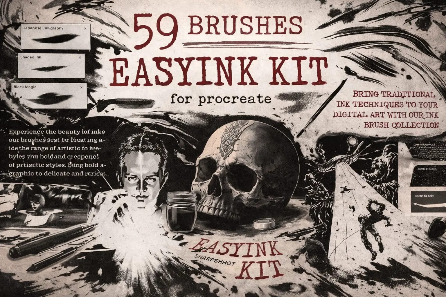
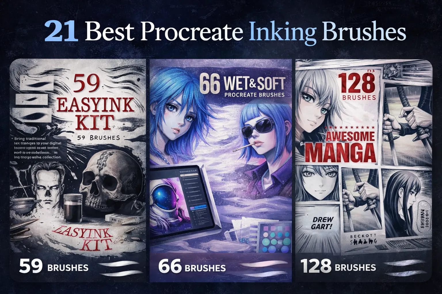
59 Easy Ink Brushes
The most versatile set. Includes liners, messy inks, and dry brushes. Perfect daily driver for any artist.
VIEW BUNDLE →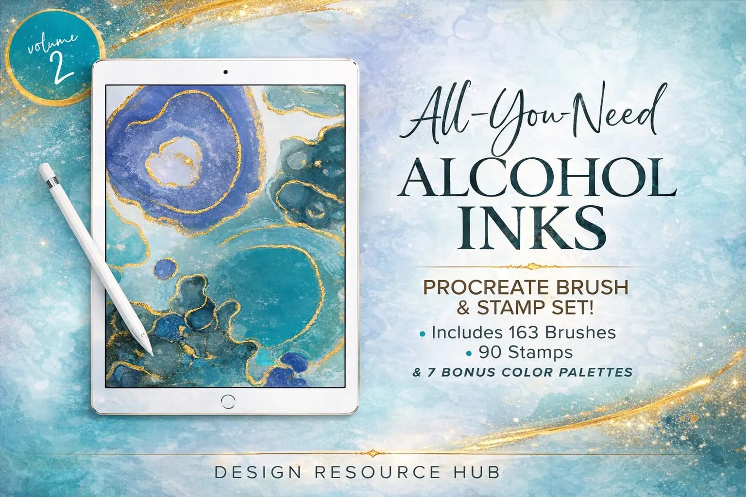
Alcohol Ink Megapack
Stunning visual effects. Create realistic fluid art, foil textures, and marble flows instantly.
VIEW BUNDLE →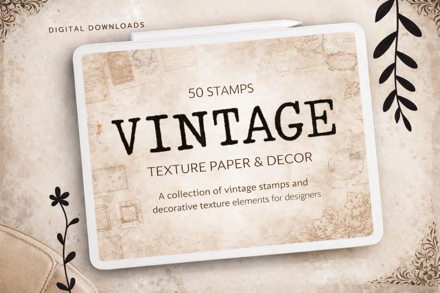
Vintage Paper & Ink
For retro lovers. Adds the texture of old paper and worn-out typewriter ink to your art automatically.
VIEW BUNDLE →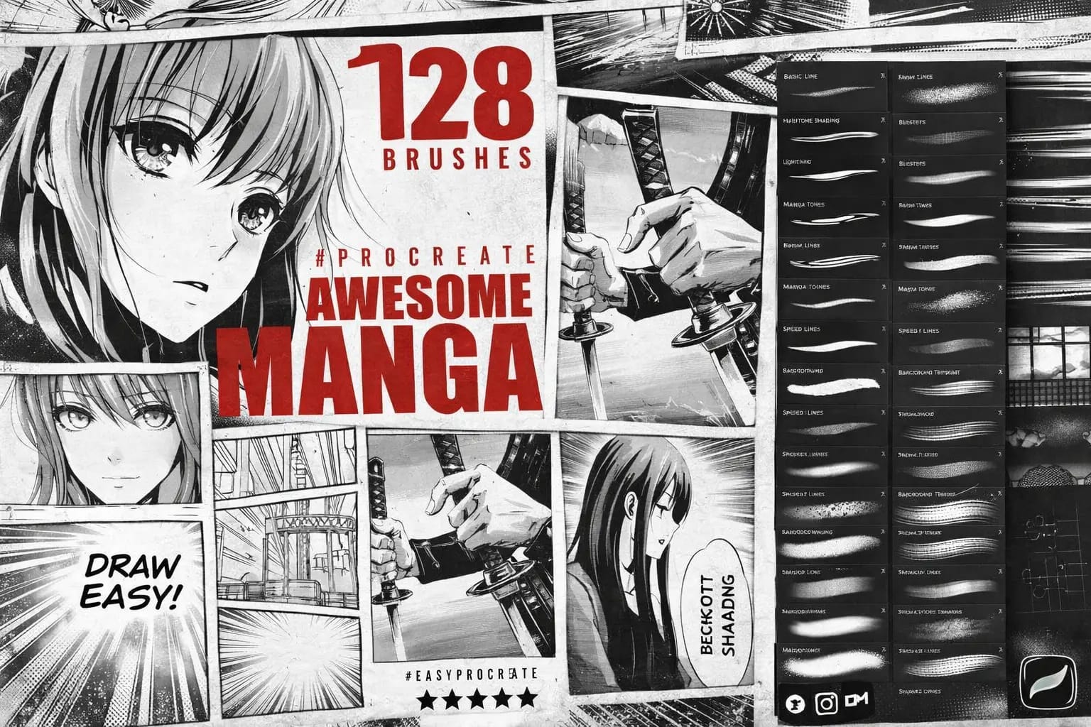
Awesome Manga Kit
Everything for Anime: Crisp G-Pens, screentones, and dynamic liners for perfectly clean line art.
VIEW BUNDLE →Download ALL 21 Inking Packs for Free!
Don't want to buy them individually? You can unlock every single brush set on this list immediately for $0.
Pro Tip: Sign up for the Creative Fabrica All-Access Free Trial to instantly download unlimited inking kits and paper textures.
The 21 Best Procreate Inking Brushes for 2026
Below is our fully ranked collection. I've organized these tools into logical categories—starting with all-in-one professional bundles and manga kits, moving into clean micron liners and comic inking styles, and finishing with authentic Sumi-e and vintage textures to give your digital ink work a real-world feel.

Why I picked it:
- ✅ All-in-One Versatility: I’m impressed by the range; I can switch from messy dry textures to razor-sharp technical liners within the same piece effortlessly.
- ✅ Organic Edge Detail: The edges aren't "perfectly digital." I noticed tiny, realistic imperfections and ink bleeds that give my art a convincing handmade soul.
- ✅ Intuitive Pressure: The taper is spot on. I found it very easy to control line weight from a thin whisper to a bold stroke just by adjusting my hand pressure.

Why I picked it:
- ✅ Organic Pigment Build-up: I love how these brushes interact. When you overlap strokes, they create a beautiful, messy build-up of pigment exactly like real Copic markers or ink drops on a non-porous surface.
- ✅ Pro-Grade Stamp Set: The 90 included stamps are a lifesaver. I used them to add realistic splatters and "ink rings" that give the artwork an authentic, handmade texture in seconds rather than minutes.
- ✅ Curated Color Workflow: Fluid art is 50% about the color palette. I found the 7 bonus palettes to be perfectly balanced, offering everything from vibrant neon flows to subtle, classy marble tones.
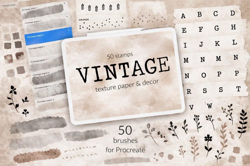
Why I picked it:
- ✅ Seamless Paper Bases: I found the 8 seamless background stamps to be incredibly high-quality; they don't lose detail even when I work on large 4K canvases.
- ✅ Typewriter Aesthetics: The included typewriter letters and floral stamps allow me to build a complete vintage layout without needing any external assets.
- ✅ Expert Color Matching: I really appreciated the included color swatches—they are perfectly tuned to complement the aged paper tones right out of the box.

Why I picked it:
- ✅ Classic Line Snap: The 39 line brushes have an incredible "snap" and pressure sensitivity, perfectly mimicking the sharp, dynamic strokes of traditional Japanese nibs.
- ✅ Hair Styling Shortcuts: I found the 5 specialized hair brushes to be a massive time-saver for drawing complex anime styles with consistent texture.
- ✅ Authentic Shading: The 27 halftone brushes are spot-on; they add that nostalgic, grainy texture that defines the classic manga aesthetic effortlessly.
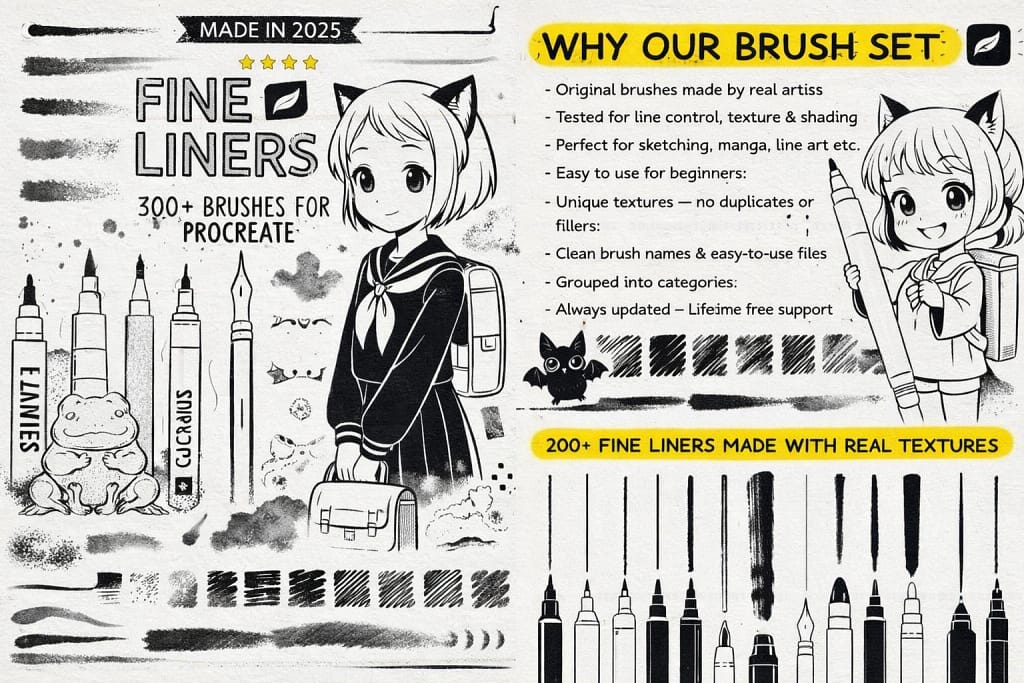
Why I picked it:
- ✅ Ultimate Variety: With 200+ textured line and sketch brushes, I noticed I can achieve a much more organic, "alive" feel in my architectural and technical drawings.
- ✅ Natural Flow: I found the 50+ inking tools offer a very natural, flowing stroke that never feels artificial or too "sticky" on the digital canvas.
- ✅ Traditional Texture: I love the 20 included high-quality paper textures; they give the digital ink a beautiful, slightly absorbent look like real stationery.
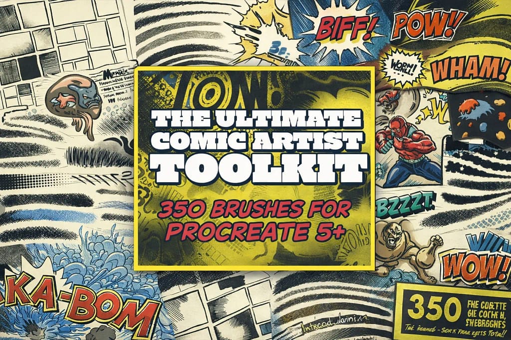
Why I picked it:
- ✅ Instant World Building: I found the scene and panel stamps to be huge time-savers. I can block out a complex background or a multi-panel layout in seconds rather than sketching from scratch.
- ✅ Classic Ink Hatching: I noticed the 26 hatching brushes have a unique "nib resistance" feel. They are perfect for that fast, rhythmic cross-hatching seen in vintage American comics.
- ✅ Dynamic Sound FX: The Sound FX word stamps are the cherry on top. I love how they instantly add that "Wham!" and "Pow!" energy that makes a page feel truly finished.
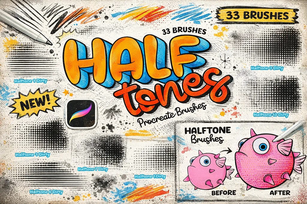
Why I picked it:
- ✅ Pressure-Sensitive Shading: I found that these brushes react beautifully to the Apple Pencil, allowing me to fade dots from large to small just by varying my hand pressure.
- ✅ Clean & Dirty Variations: I really like that you get both "clean" digital dots and "dirty" textured versions, which gave my work a much more authentic, weathered comic book feel.
- ✅ Instant Depth: I noticed that even a simple flat sketch looks 10x more professional once you lay down these halftones—it’s an essential shortcut for any graphic artist.
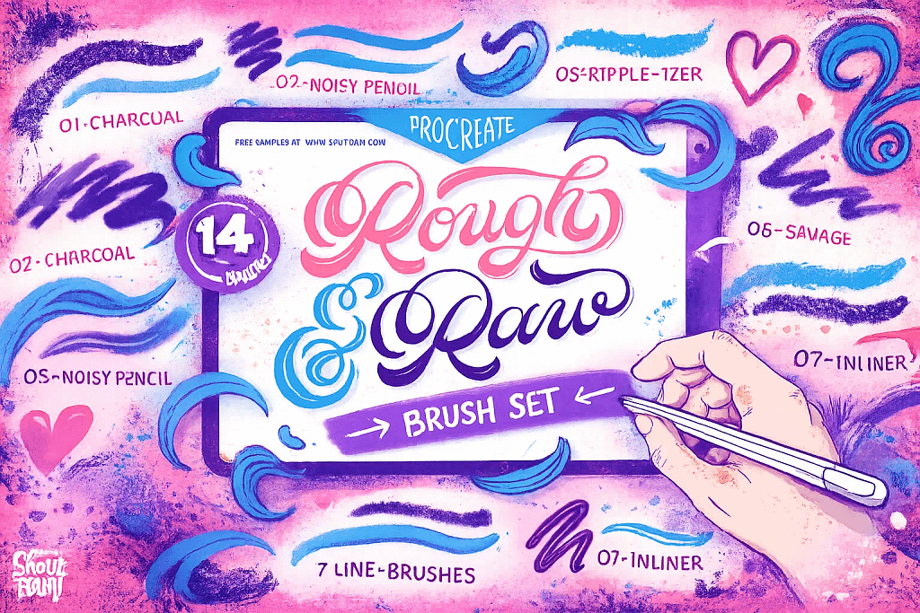
Why I picked it:
- ✅ Gritty Line Character: I found the "Noisy Pencil" and "Charcoal" brushes to be perfect for sketching; they have a beautiful, unrefined grit that adds instant soul to a drawing.
- ✅ The Ripple-izer: This is a hidden gem. I used it to achieve a distressed, mid-century retro feel that usually requires complex post-processing, but here it's just one stroke.
- ✅ Texture Overlays: I noticed the "Dirty Sponge" and "Wood Texturizer" add a brilliant layer of chaos to flat colors, making my illustrations look like they were printed on old stationery.
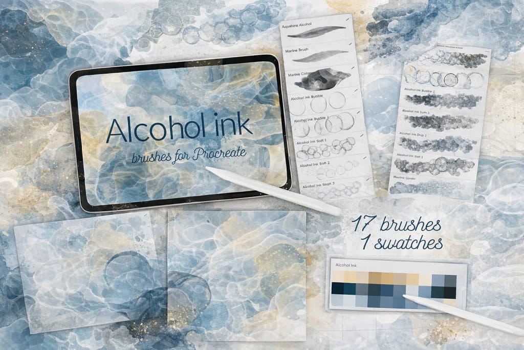
Why I picked it:
- ✅ Smart Color Dynamics: I noticed that these 17 brushes have a unique ability to shift hues as you paint, perfectly mimicking the way real ink separates into different pigments on paper.
- ✅ Effortless Backgrounds: I found that even with a single tap, these stamps create a professional "bloom" effect that looks incredibly high-end for branding or social media backdrops.
- ✅ Curated Navy & Gold: I love the included color palette. The navy blue and golden yellow combination is a classic for fluid art, and it saved me a lot of time on color picking.
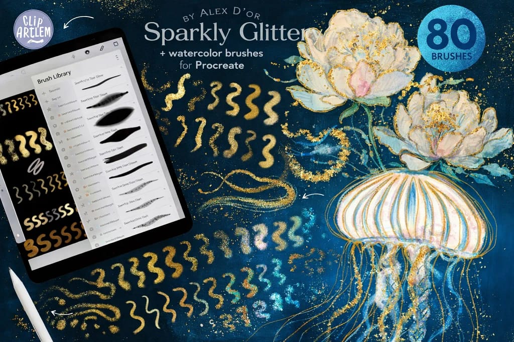
Why I picked it:
- ✅ Insane Shimmer Variety: I noticed that with 67 different shimmer styles—ranging from holographic to classic starfall—I can find the exact "sparkle" needed for any specific material or texture.
- ✅ Built-in Canvases: I found the 5 included watercolor canvases to be a game-changer; they provide the perfect "tooth" and absorbency that makes the metallic ink look incredibly realistic.
- ✅ Responsive Foiling: I love the pressure sensitivity here. I can go from a light holographic dust to a thick, solid gold leaf stroke just by adjusting how hard I press the Apple Pencil.
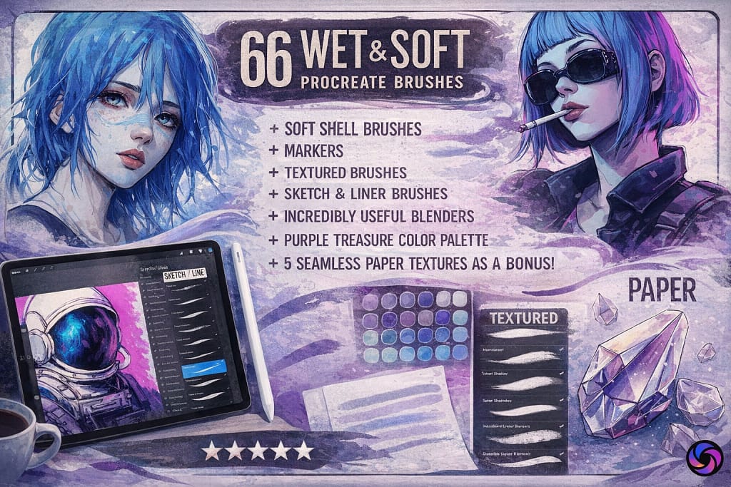
Why I picked it:
- ✅ Seamless Blending: I’m impressed by the 4 dedicated blenders; I found they mix colors with a natural "drag" that mimics real wet paint on a canvas beautifully.
- ✅ Authentic Marker Feel: I noticed the 16 marker brushes capture that classic layering effect perfectly, making them ideal for fashion illustration or delicate character design.
- ✅ Tactile Paper Grain: I love the 5 included paper textures. I tested them under the soft brushes, and the subtle grain they add makes the digital ink look incredibly tactile.
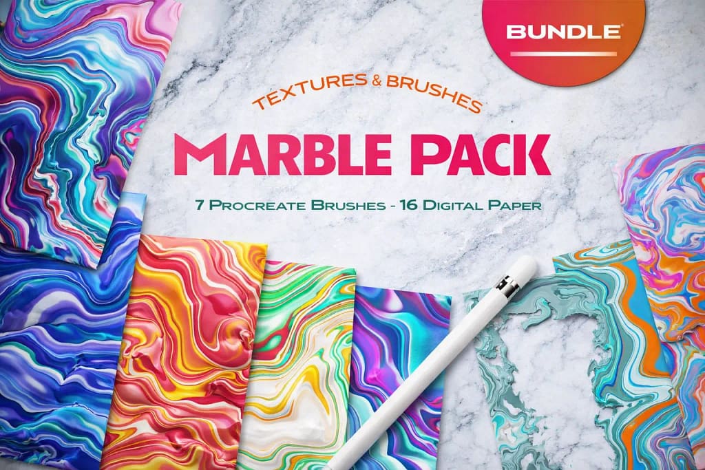
Why I picked it:
- ✅ High-Res Print Quality: I noticed the 17 digital papers are provided at 600DPI. They stay incredibly sharp even when I crop in for detailed UI designs or high-resolution print mockups.
- ✅ Versatile Transparency: I love that they included 9 textures with transparent backgrounds. It makes it so much easier to overlay these marble effects onto existing character art or custom stationery.
- ✅ The "Noise" Factor: I found the specialized 'Marble Noise' brushes particularly useful; they add a gritty, tactile grain that stops the abstract flows from looking too "perfectly digital."
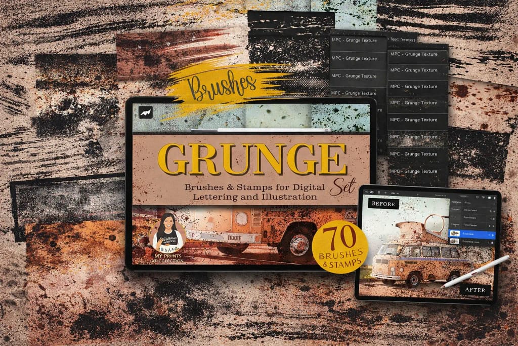
Why I picked it:
- ✅ Flawless Seamless Textures: I found the 42 seamless brushes to be incredibly well-made. I noticed they don't show any repetitive patterns, even when I cover large background areas with heavy grain or cracks.
- ✅ Precision Distressing: I love the 28 included stamps. I used them to place specific "worn-out" details and scratches exactly on the edges of my lettering to give it a convincing handmade soul.
- ✅ Analog Lettering Energy: I noticed that these brushes work wonders for digital calligraphy. They give my strokes that "bleeding ink" and "rough edge" look that is usually very hard to replicate digitally.
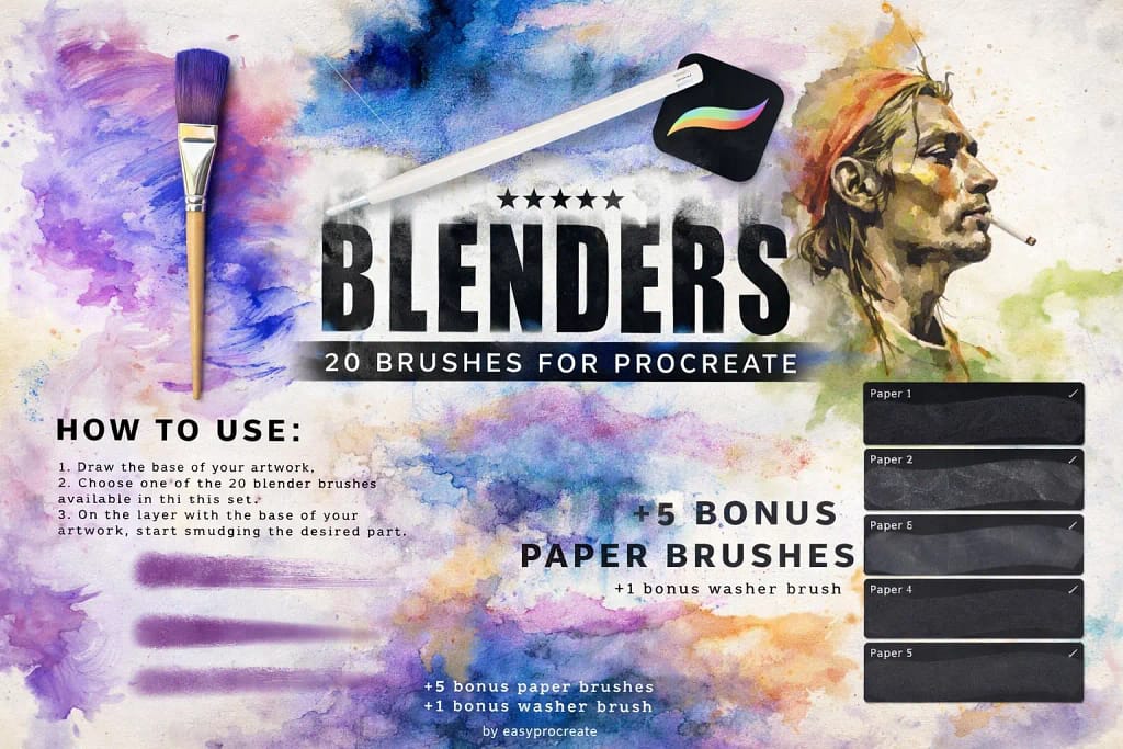
Why I picked it:
- ✅ The Magic "Washer" Brush: I noticed the bonus washer brush is a total game-changer. It allowed me to cover large background areas with a perfectly smooth, realistic wash in just one or two strokes.
- ✅ Professional Detail Fusing: I tested the 20 blenders on complex character shadows and found they integrate colors without any "muddy" artifacts, keeping the palette clean and vibrant.
- ✅ Tactile Paper Depth: I love that it includes 5 bonus paper brushes. When I layered them under my washes, they added a layer of realism that makes the digital art look truly authentic.
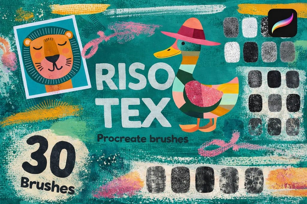
Why I picked it:
- ✅ Authentic Grainy Texture: I found the 30 brushes provide a huge range of noise levels, from light speckles to heavy, gritty textures that perfectly mimic traditional stenciling.
- ✅ Vibrant Color Layering: I noticed these brushes handle overlapping colors beautifully, allowing me to recreate the distinct, layered ink look that defines the cult-classic riso style.
- ✅ Nostalgic Energy: I love how easily it transforms sterile vector-like designs into something with a soul. It’s my top pick for cool character posters and abstract landscapes.
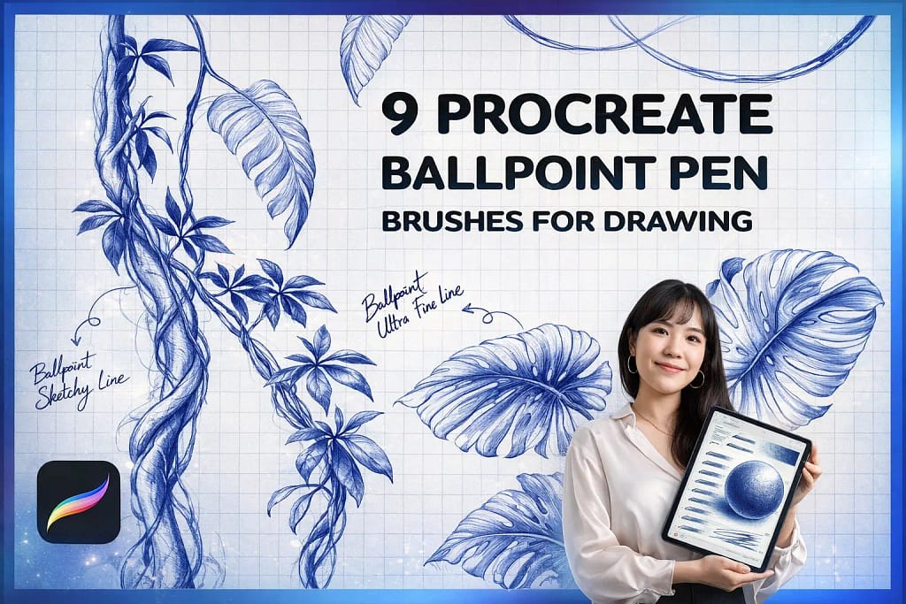
Why I picked it:
- ✅ True Pressure Dynamics: I noticed the ink builds up naturally; I can pull a barely visible ghost line or a dark, saturated stroke just by adjusting my hand pressure.
- ✅ Expert Hatching Tools: I found the specialized "Patch Hatching" and "Scumbling" brushes to be fantastic for adding complex textures that look hand-drawn, not mechanical.
- ✅ Bonus Stationery Textures: I love that it includes paper and grid textures. Layering my sketches over the grid instantly gave them that authentic "doodle-in-a-notebook" energy.
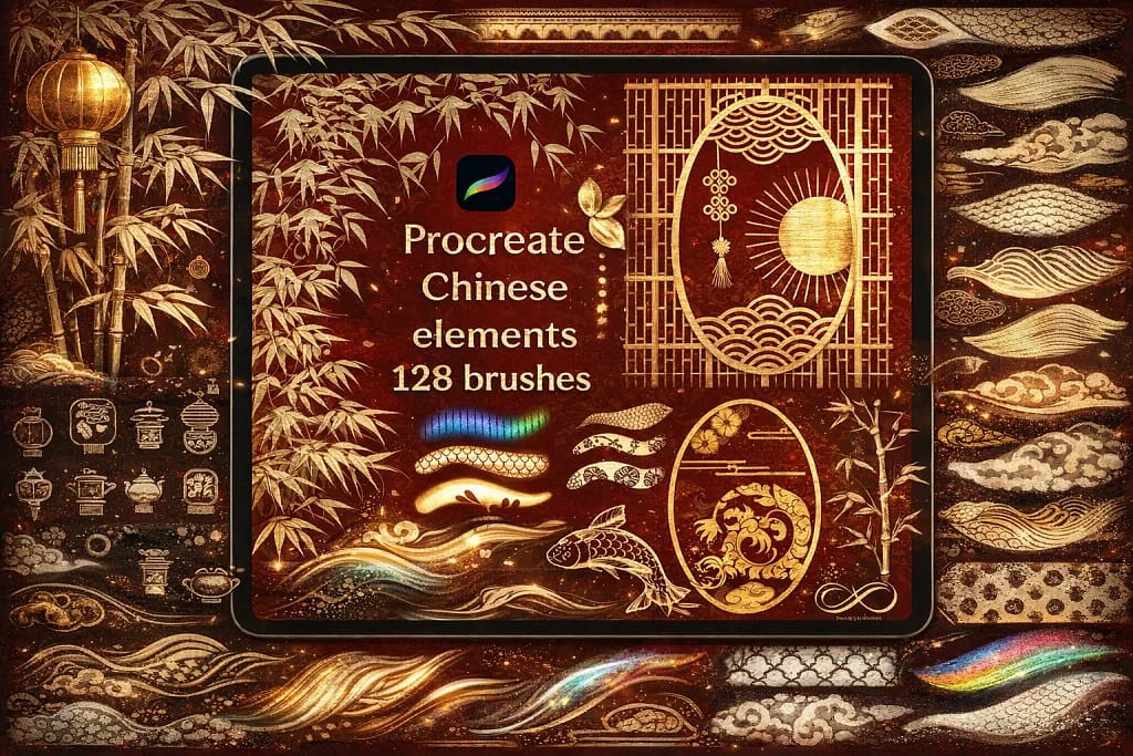
Why I picked it:
- ✅ Authentic Ink Bleed: I found the wash brushes perfectly capture that beautiful, "uncontrolled" bleeding effect of real ink, giving my digital art an instant, handmade classic feel.
- ✅ Massive Element Library: I noticed the 128 elements include everything from complex dragons to traditional architecture stamps, which allowed me to build detailed scenes in a fraction of the usual time.
- ✅ Curated Color Flow: I love the included color palette. I tested it on several landscapes and found it offers the exact earthy and vibrant tones required for high-end Chinese-style art.
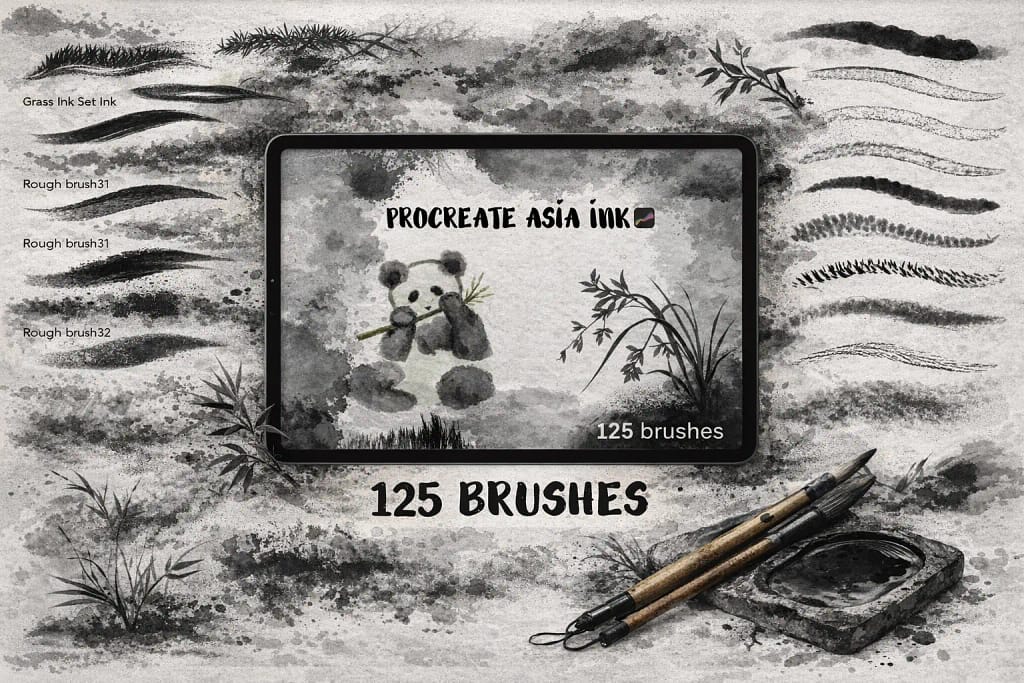
Why I picked it:
- ✅ Versatile Stroke Library: I found that the range—from ultra-fine liners to heavy wash brushes—allowed me to create complex bamboo and animal textures without needing any other pack.
- ✅ Responsive Ink Bleeding: I noticed the ink bleed is very responsive to pressure. It doesn't look like a static texture; it actually feels like the ink is expanding on the digital canvas as you press.
- ✅ Pro Calligraphy Spring: The brushes have a perfect "spring" to them. I love how the tips behave, making it easy to achieve that signature sharp taper found in traditional Asian calligraphy.
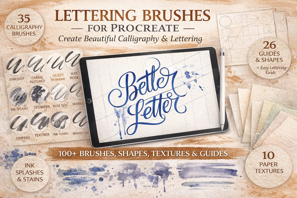
Why I picked it:
- ✅ Perfect Contrast Control: I found the 28 calligraphy brushes offer a very satisfying "snap" between thin upstrokes and thick downstrokes, which is essential for that clean, modern look.
- ✅ Guided Consistency: I noticed the 26 grids and shapes are a massive help for maintaining consistency. They act as "training wheels" that help you build muscle memory for perfect layouts.
- ✅ High-Res Paper Feel: I love the 10 included paper textures. I tested them under the lettering and found they provide a beautiful, slightly absorbent look that mimics real vellum paper.
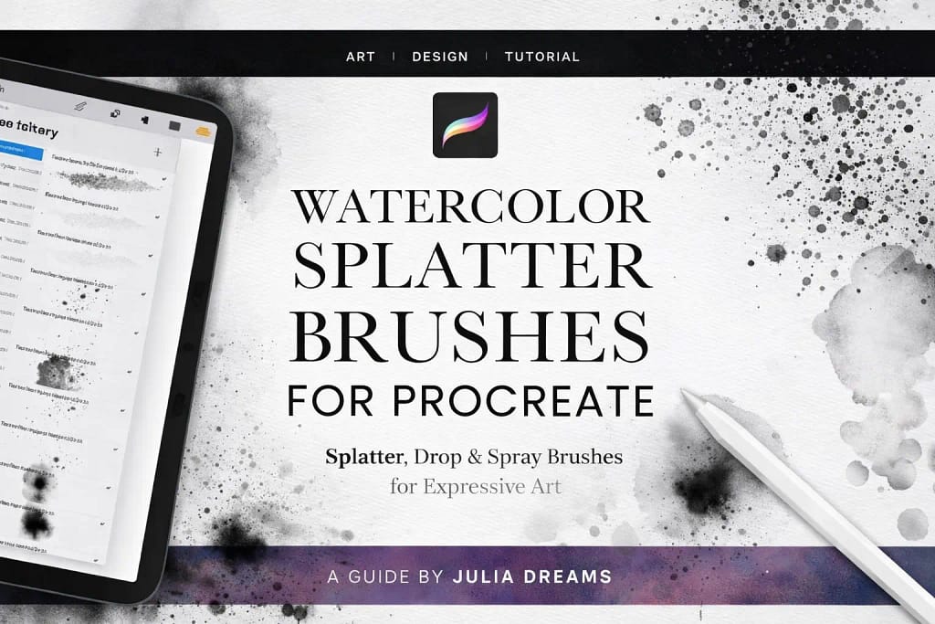
Why I picked it:
- ✅ Organic Pigment Clusters: I noticed that the splatters don't look like repeated stamps; they have varying densities and realistic "tails" that perfectly mimic traditional ink hitting paper.
- ✅ Great Texture Variety: I found the mix of fine sprays and larger drops to be very well-balanced, allowing me to add subtle grit or bold, expressive ink-blooms with just one tap.
- ✅ Perfect Finishing Touch: I love using these for background depth. I noticed that layering a few transparent splatters behind a character instantly gives the composition a professional, gallery-ready feel.
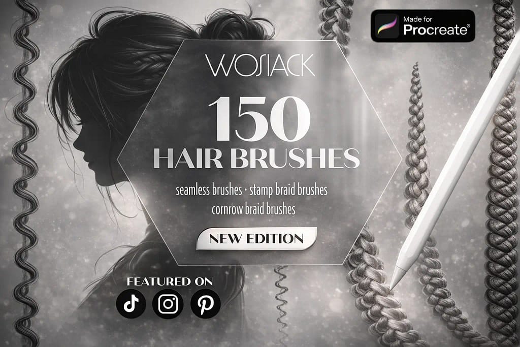
Why I picked it:
- ✅ Incredible Variety: I found that covering 150 different styles—from flowing curls to fine individual strands—makes this the only hair library you’ll ever really need.
- ✅ Precision Braid Stamps: I was particularly impressed by the braid and cornrow stamps. I noticed they save hours of repetitive work while maintaining a hyper-realistic, hand-drawn look.
- ✅ Seamless Blending: I love how these brushes blend. I tested them on both Procreate and Procreate Pocket, and found the flow to be smooth and intuitive even for beginners.
FAQ
For professional results, you should look for brushes with high pressure sensitivity and organic "bleed" effects. Based on my tests, the 59 Easy Ink Bundle is the best overall choice. It mimics traditional nibs and technical pens with zero lag, providing a tactile friction that default Procreate brushes often lack.
If you are working on comics, you need specialized tools like G-pens and screentones. The Awesome Manga Kit and the Comic Artist Toolkit are specifically designed for this workflow. They allow you to handle everything from sharp character outlines to classic halftone shading, following professional industry standards directly on your iPad.
Standard inking brushes are designed for clean lines, outlines, and silhouettes. Alcohol Ink brushes, on the other hand, focus on fluid dynamics and translucent layering. They are perfect for creating "blooming" effects, realistic marker-style illustrations, and abstract marble textures rather than just simple linework.
While you can find free sets, they often lack the complex grain and refined pressure-curve tuning found in premium packs. A smart "pro-tip" for artists on a budget: instead of searching for limited freebies, you can use the Creative Fabrica $1 All-Access Trial. This allows you to legally download any professional ink brush set from this list for almost no cost.
To achieve a realistic analog look, you need a brush with "organic edges" (tiny imperfections) rather than a perfectly smooth digital line. Additionally, I always recommend using a high-quality Paper Texture stamp. Kits like Vintage Paper & Ink provide these backgrounds, which interact with the brushes to create the illusion of ink absorption and real paper tooth.
Yes! All the sets mentioned in this guide are compatible with both the iPad version and Procreate Pocket. However, for the best inking experience, I highly recommend using an Apple Pencil to take full advantage of the pressure-sensitive features built into these professional tools.
 Precision Liners
 Ultimate Artist Toolkit

