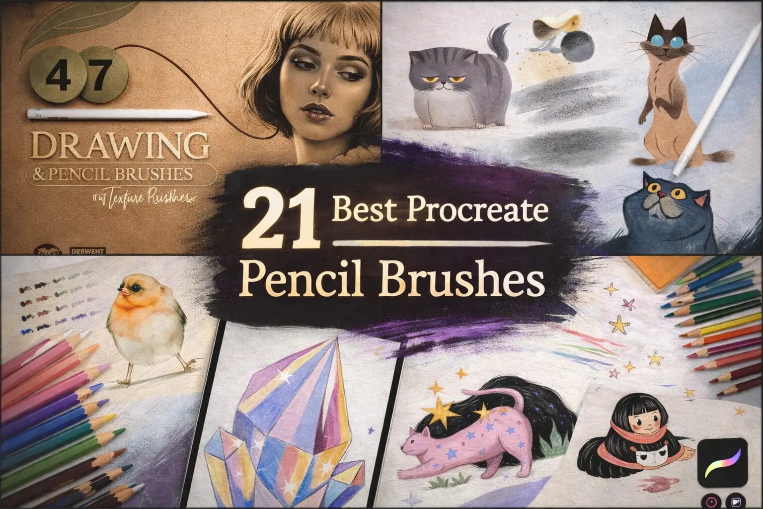
Digital pencils often feel like sliding on glass—too slippery, too "perfect," and completely lacking that satisfying friction of real graphite. To fix this, I spent weeks testing over 60 sets to find the top 21 pencil brushes that restore that tactile analog soul to your iPad.
Whether you need a buttery 6B for heavy shading, a professional mechanical pencil for clean lines, or vibrant wax textures for Pinterest-ready illustrations—your perfect tool is right here.
🏆 Editor’s Choice
The 4 most essential pencil kits for Procreate (2026).

Ultimate Graphite Case
The most realistic graphite feel. Includes everything from 2H to 9B with perfect tilt shading.
VIEW PENCIL SET →
Wax Colored Pencils
Professional-grade wax texture. Perfect for vibrant illustrations and soft, buttery blending.
VIEW COLORS →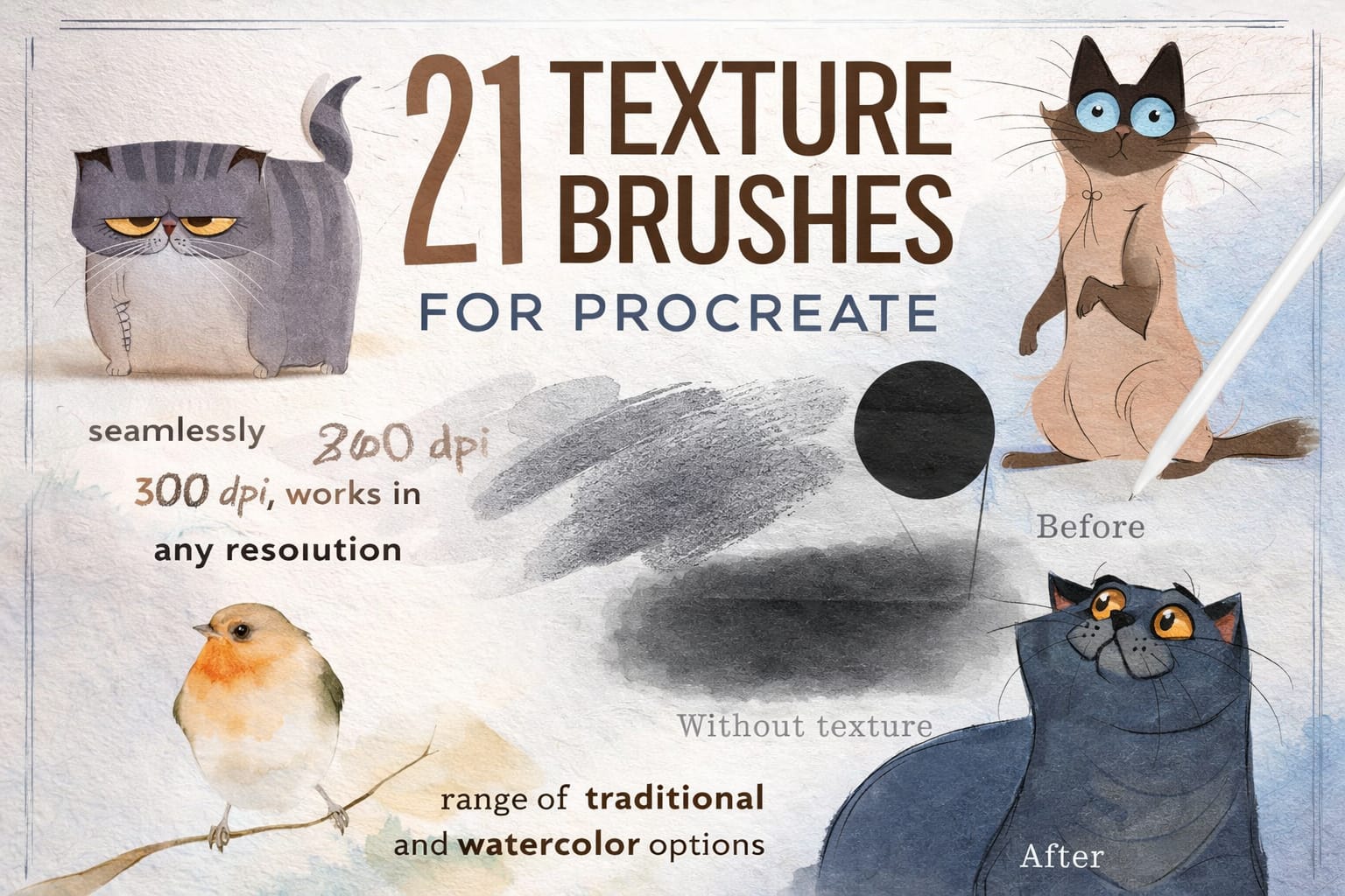
Realistic Paper & Grain
Adds authentic paper tooth to your strokes. The secret to making digital art look like real paper.
VIEW TEXTURES →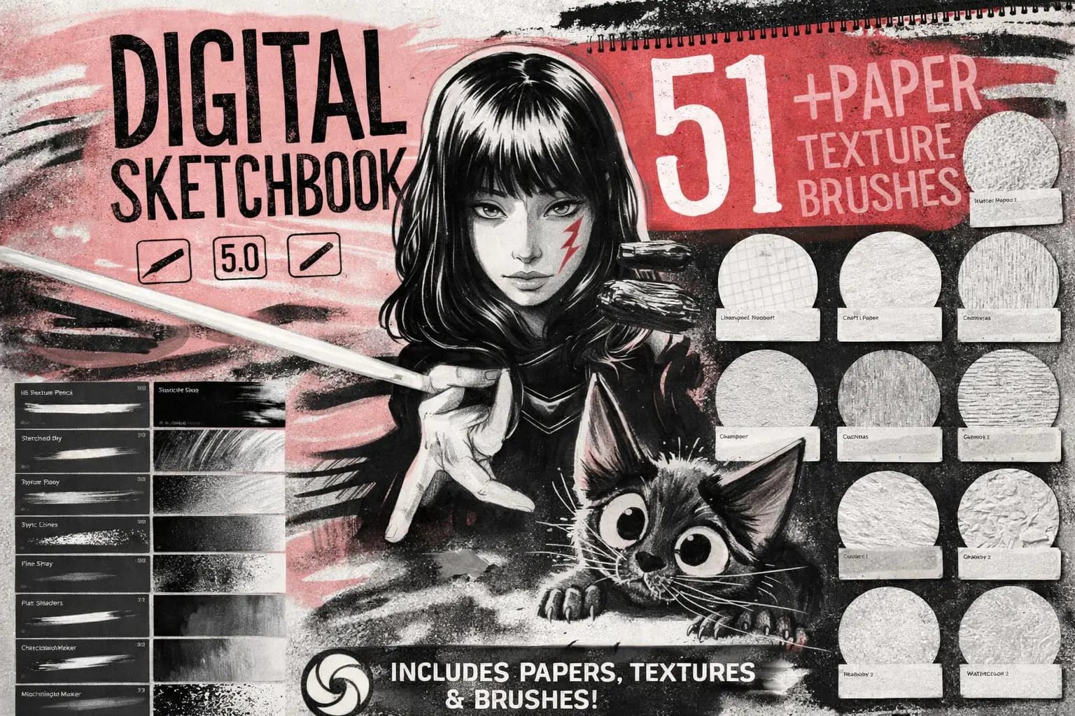
Digital Sketchbook Pro
Optimized for gestural drawing and quick concepts. High response and zero lag for fast artists.
VIEW SKETCH KIT →Hunting for Free Pencils?
Freebies often lack the "tilt" shading and pressure physics that make a brush feel real.
Smart Tip: You can download any premium set from this list for free by starting a $1 All-Access Trial. It's the best way to get professional tools legally.
The 21 Best Procreate Pencil Brushes (Ranked)
Below is my hand-picked selection of the most realistic graphite leads, buttery wax pencils, and high-precision drafters. I’ve organized them by medium—from **Traditional Graphite** for classic sketching to **Vibrant Colored Pencils** for professional illustrations—ensuring you find the exact texture to make your digital canvas feel like real paper.
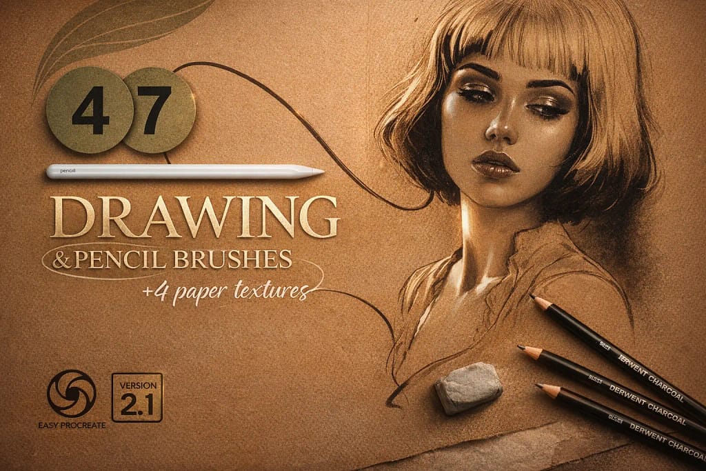
Why I picked it:
- ✅ True-to-Life Lead Physics: I love the variety; I can switch from a sharp, technical 2H for construction lines to a soft, buttery 9B for deep shading without it ever looking "fake."
- ✅ Tactile Paper Bonus: I noticed that applying the 4 included paper textures under my sketches instantly added that "tooth" that makes pencil strokes look incredibly organic.
- ✅ Mixed Media Versatility: Beyond just graphite, I found the included blenders and ballpoint brushes to be a huge bonus for creating professional-level finished illustrations in one go.
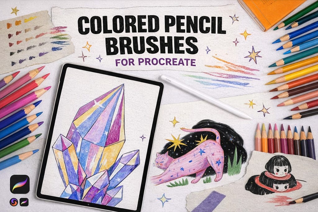
Why I picked it:
- ✅ Seamless Wax Blending: I found the 3 specialized blending brushes to be the star of the show. They mix colors with a soft, creamy logic that captures the soul of traditional media perfectly.
- ✅ Curated Color Flow: I noticed that the included color palette is expertly tuned for colored pencils—saving me huge amounts of time trying to find those "natural" vibrant hues.
- ✅ Built-in Paper Grain: I love that it comes with 2 bonus seamless textures. I tested them with the lighter hardness brushes and found they provide that perfect "tooth" for professional results.
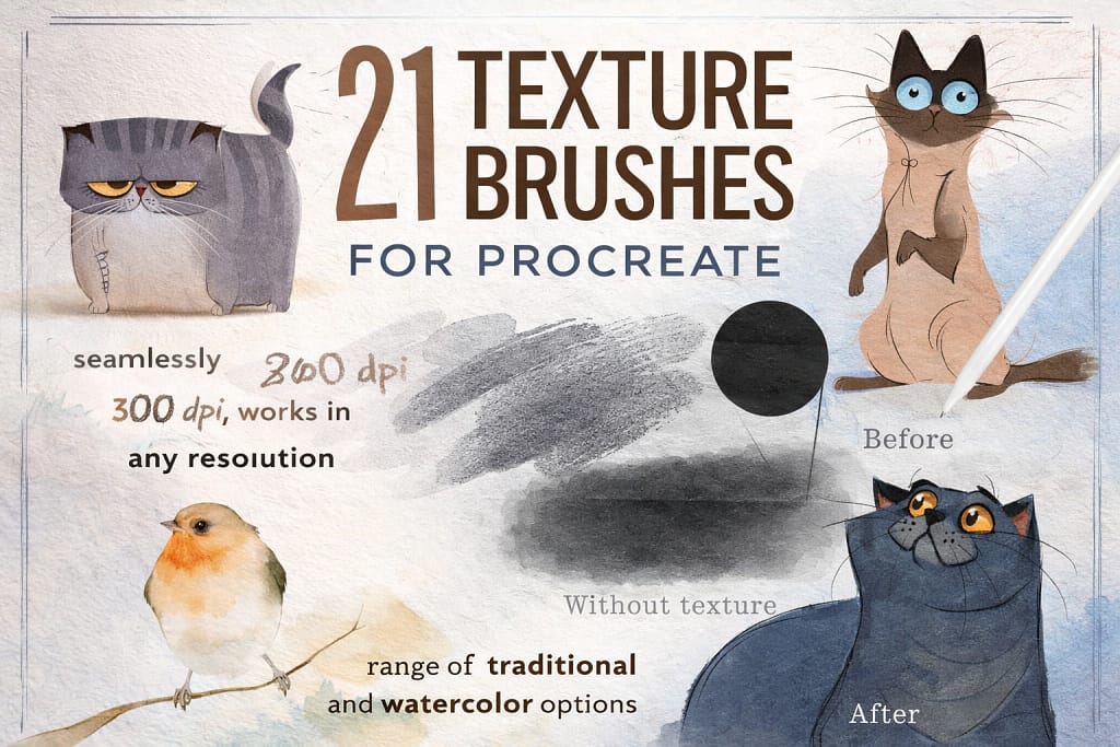
Why I picked it:
- ✅ Seamless 600DPI Quality: I found that these textures repeat perfectly across any canvas size. I noticed zero visible seams even when working on large, high-resolution 4K illustrations.
- ✅ Organic Imperfections: I love the textures with subtle marks and stains. They add a "found-in-the-attic" charm that makes my drawings feel like real history rather than a digital file.
- ✅ Effortless Workflow: I noticed these work brilliantly as overlays. Just set the layer to Multiply or Linear Burn, and you instantly have a professional "tooth" that reacts with your pencil.
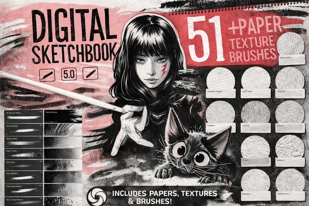
Why I picked it:
- ✅ Exceptional Response Time: I noticed that these brushes have zero lag. I found them perfect for quick construction lines and rapid sketching where precision and speed are equally critical.
- ✅ Atmospheric Textures: I love the 13 included high-quality seamless papers. They instantly add a professional "canvas" look that makes even a simple sketch feel like a finished gallery piece.
- ✅ Unique Scrapbook Elements: I found the torn paper stamps to be a brilliant touch. I used them to create a "collage" aesthetic in my sketchbook pages that is usually very hard to replicate digitally.
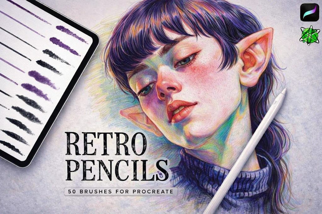
Why I picked it:
- ✅ Vintage Shading Logic: The specialized shaders and textural brushes deliver a beautiful nostalgic energy. I noticed how effortlessly they add atmospheric depth to flat colors, giving them an immediate hand-drawn soul.
- ✅ High-Precision Liners: Beyond the grit, the pencil brushes for clean lines are remarkably stable. Every stroke feels intentional, making it easy to transition from a messy rough study to detailed final work.
- ✅ Included Texture Depth: Bonus paper textures provide that extra layer of authenticity. These elements work in perfect harmony with the brushes to ensure your digital art looks like it was scanned from an old artbook.
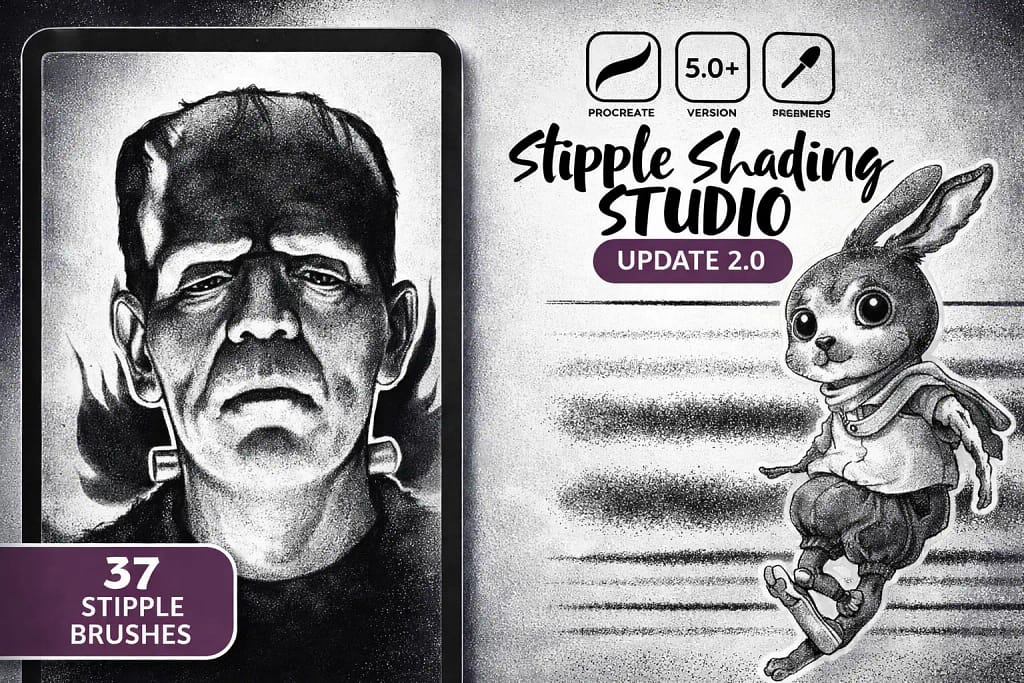
Why I picked it:
- ✅ Dynamic Pressure Dots: The "Stipple Liner" brushes are remarkably responsive. I found that I could control the density of the dots just by varying hand pressure, creating smooth transitions from light to dark with ease.
- ✅ Classic Comic Texture: Testing the different stipple sizes revealed a perfect "noisy" grit. This adds a layer of professional character design energy that makes flat sketches look like finished graphic novel art.
- ✅ High-Speed Detailing: These brushes save hours of work. Instead of placing thousands of individual dots, one stroke provides a perfectly randomized grain that keeps the drawing looking organic and handmade.
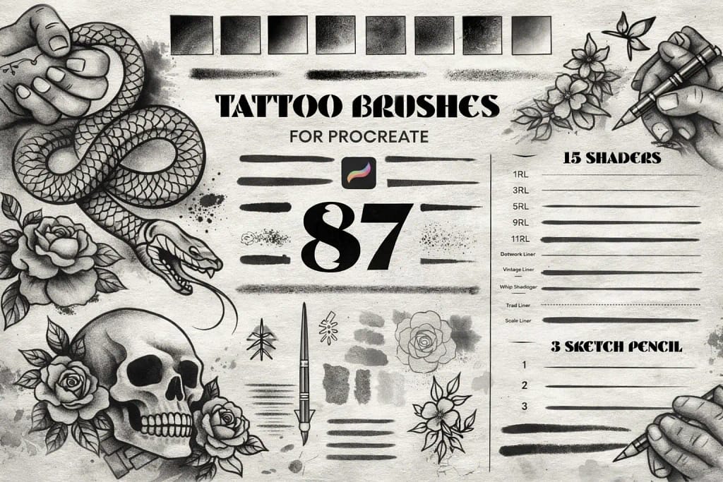
Why I picked it:
- ✅ Flawless Whip-Shading: The 15 dedicated shaders are the highlight here. They provide a perfectly randomized grain that mimics traditional ink saturation, making it easy to create smooth but textured transitions.
- ✅ Complete Design Toolkit: Having 87 different tools means you can handle everything from bold outlines to delicate dot-work within the same project without switching packs constantly.
- ✅ Ready-to-Use Canvases: I found the 10 bonus paper textures to be a massive time-saver. They provide the necessary "tooth" and surface feel that makes the digital ink look like it’s actually bonded to the paper.
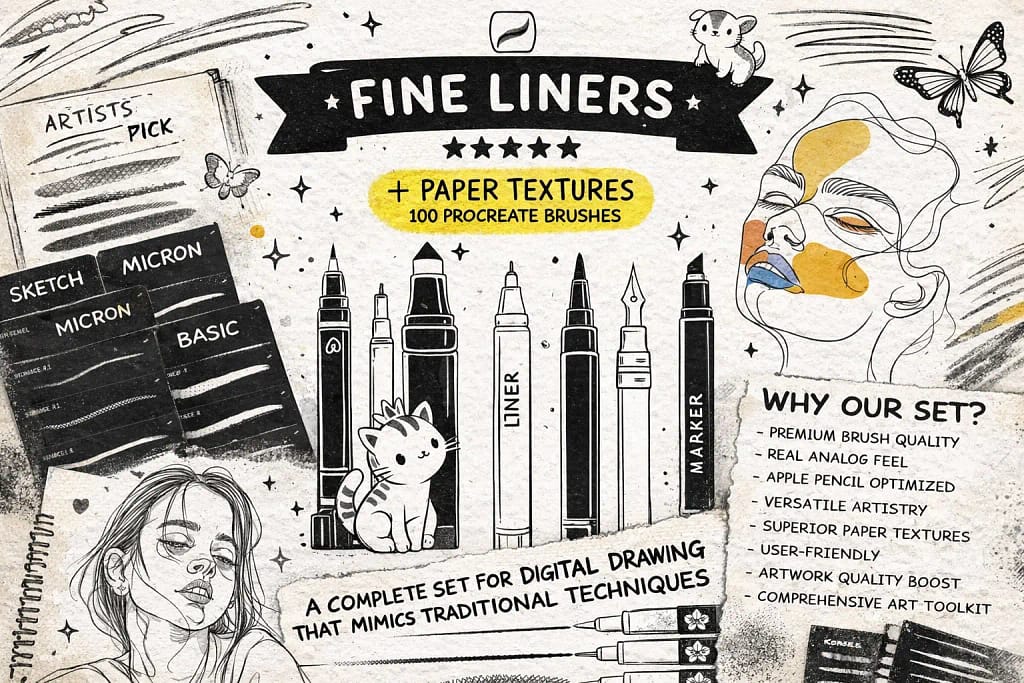
Why I picked it:
- ✅ True Technical Weights: The range of line weights (from 0.05 to 0.8) is remarkably accurate. I found it easy to maintain consistent thickness, which is critical for architectural sketches and clean comic art.
- ✅ Atmospheric Stippling: Beyond simple lines, the natural stipple brushes provided a great way to add shading and texture. I noticed they blend perfectly with pencil gradients to create professional-level depth.
- ✅ Authentic Surface Feel: Bundled with 13 seamless paper textures, this pack ensures the ink doesn't look flat. Testing them together revealed a beautiful analog depth that looks stunning on any iPad screen.
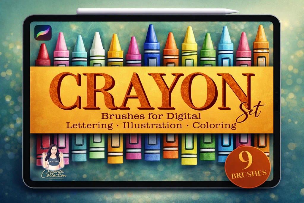
Why I picked it:
- ✅ Realistic Wax Skip: The way the pigment breaks over the canvas grain is fantastic. I noticed it perfectly mimics the uneven, tactile drag of a real crayon on paper.
- ✅ Unexpected Lettering Utility: I found these brushes work surprisingly well for modern calligraphy. They give letters a rough, waxy edge that stands out from standard smooth markers.
- ✅ Simple But Versatile: Having just 9 brushes means no clutter. I found that this range covers everything from fine scratchy linework to heavy, saturated wax fills effortlessly.
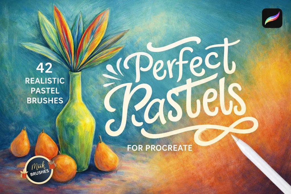
Why I picked it:
- ✅ Buttery Oil Pastels: The consistency of the oil-based brushes is remarkable. They blend smoothly and give the artwork a rich, painterly depth that looks incredibly vibrant on the digital canvas.
- ✅ Nostalgic Chalk Grit: I noticed the chalk brushes perfectly recreate that powdery residue you get on a blackboard. They are fantastic for adding rough textures and sketchy, expressive lines.
- ✅ Detail Accents: Beyond the basics, the included "Texture Accents" add dabs and specks that provide a unique tactile dimension, making the final illustration look much more organic and handmade.
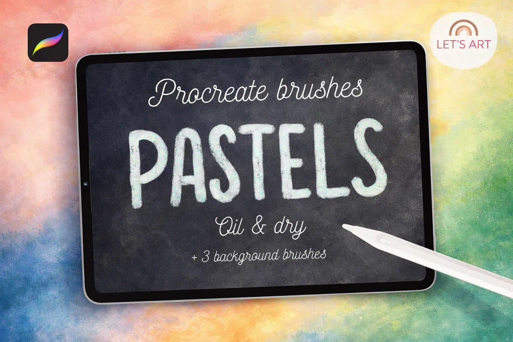
Why I picked it:
- ✅ Natural Color Fusion: The blending logic is spot on. I noticed colors mix on the digital canvas just like real wax-heavy sticks, allowing for beautiful, expressive gradients without any muddy artifacts.
- ✅ Specialized Grit Variety: The 5 texture brushes are very distinct. I found they cover everything from a dry, scratchy stroke to a fully saturated oil mark, giving you great control over the final look.
- ✅ Included Background Canvas: The 3 seamless paper textures (especially the craft paper) are vital. Testing them underneath the brushes immediately added that tactile depth that makes digital art look physical.
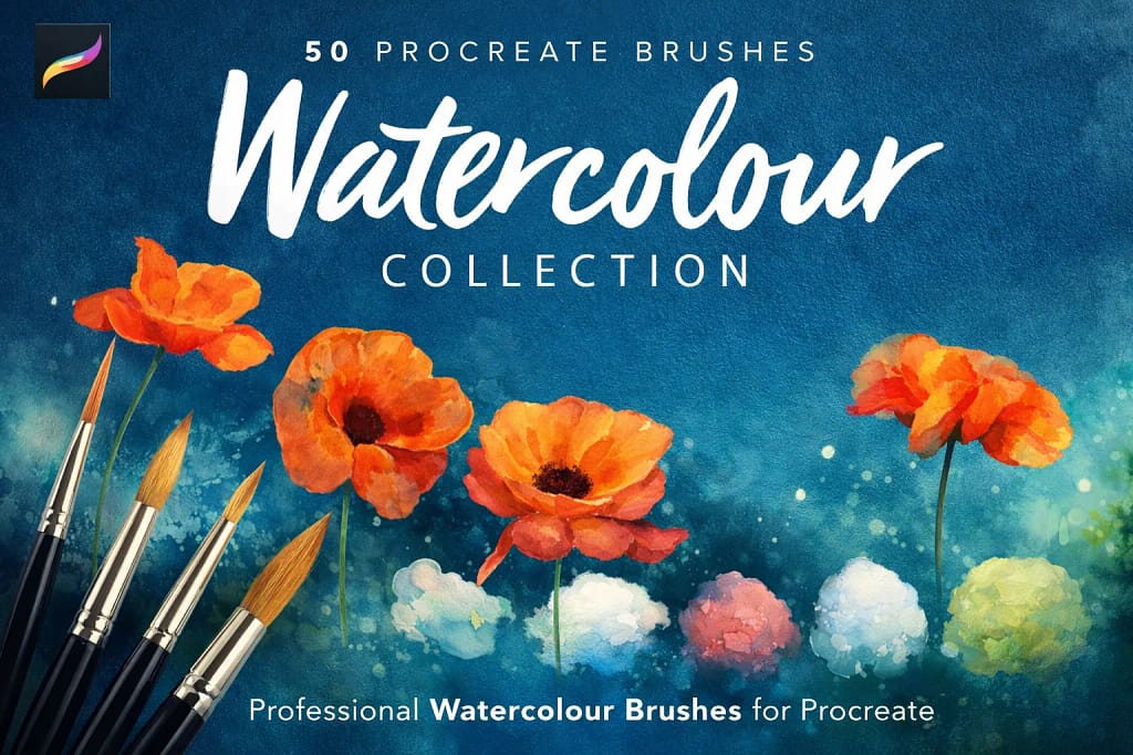
Why I picked it:
- ✅ Realistic Fluid Dynamics: The brushes have a beautiful "bleed" effect. I noticed they react intuitively to hand pressure—some remain opaque like gouache, while others sheer out into delicate, watery layers.
- ✅ Pigmentless Blenders: I was particularly impressed by the dedicated blenders. They carry no color themselves, allowing you to create realistic splatter and "cloud" effects by simply manipulating existing strokes.
- ✅ Pro-Grade Canvas Base: The inclusion of 6 high-resolution (300dpi) watercolor papers is a huge value. Testing these textures under the brushes instantly created that professional, gallery-ready depth.
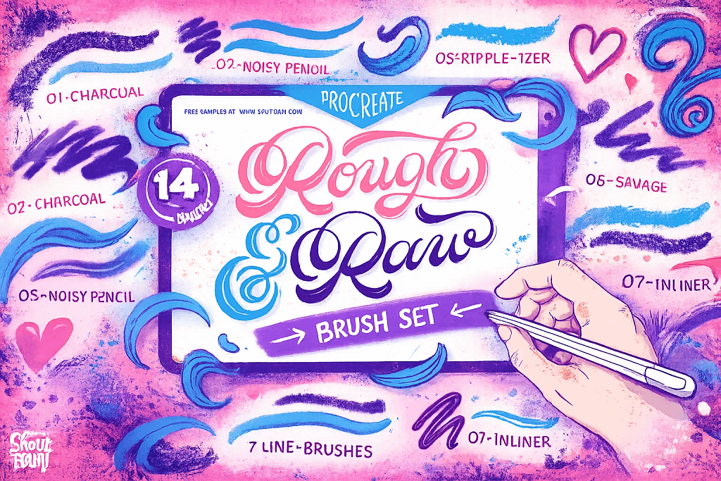
Why I picked it:
- ✅ Unrefined Sketching Logic: The "Noisy Pencil" and "Charcoal" brushes are fantastic for rough concepts. They provide a nice, scratchy resistance that feels like working on high-tooth paper, encouraging a more loose and energetic drawing style.
- ✅ The Ripple-izer Effect: Fans of retro design will love the "Ripple-izer" brush. It creates a distressed, vibrating edge that instantly gives illustrations a vintage soul that is usually very time-consuming to replicate manually.
- ✅ Versatile Texture Accents: Beyond lines, the "Wood Texturizer" and "Dirty Sponge" add brilliant layers of chaos to flat areas. These brushes are perfect for breaking up uniform colors and adding professional-grade surface depth.
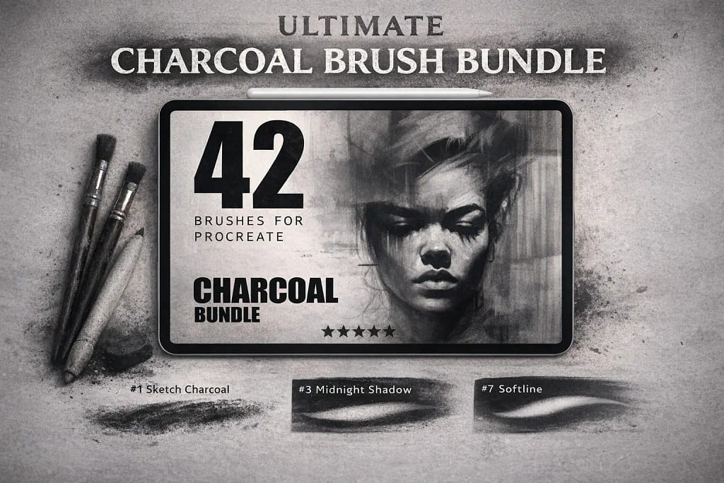
Why I picked it:
- ✅ Deep Saturated Values: The blending brushes are standout performers. They allow you to pull dark, rich values and soften them into ethereal shadows that look exactly like real physical media.
- ✅ Gritty Texture Variety: Every stroke carries an authentic "tooth." You can feel the digital lead catching on the virtual paper, which adds a professional level of depth to even the quickest sketches.
- ✅ Responsive Shading Logic: With 42 tools, this kit handles everything. Moving from fine detail work to expressive, rough blocks of color feels natural and highly responsive to the Apple Pencil’s pressure.
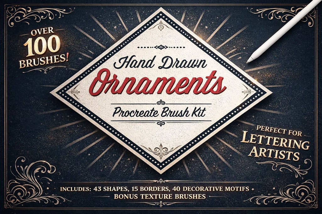
Why I picked it:
- ✅ Instant Layout Control: The 15 seamless border brushes are standout tools. I found them perfect for creating consistent, high-quality edges around my sketches and lettering projects in seconds.
- ✅ Huge Element Library: With 43 corner motifs and 20 solid shapes, the creative combinations are virtually endless. I noticed that these elements stay sharp and professional even when scaled up for high-res canvases.
- ✅ Lettering-Ready Accents: These brushes were designed with calligraphy in mind. I found the decorative flourishes added a level of professional polish to my typography that used to take hours to draw manually.
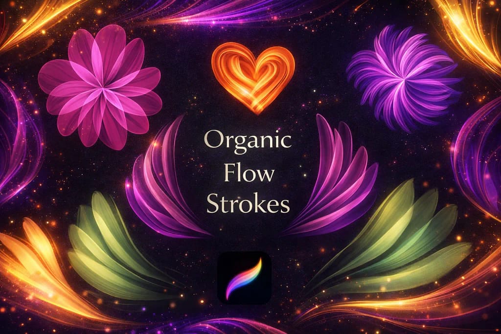
Why I picked it:
- ✅ Painterly Movement: The organic flow of these strokes is addictive. I noticed how easily they add a sense of motion to sketches, making it effortless to create flowing hair or soft, rhythmic shapes.
- ✅ Versatile Glow Accents: Beyond traditional drawing, these brushes work wonders for highlights. I found them particularly useful for digital makeup effects like lip glow and skin warmth.
- ✅ Zero-Lag Expression: Performance is snappy and responsive. Despite the complex "wavy" textures, every brush tracks the Apple Pencil perfectly, allowing for a playful and stress-free creative process.
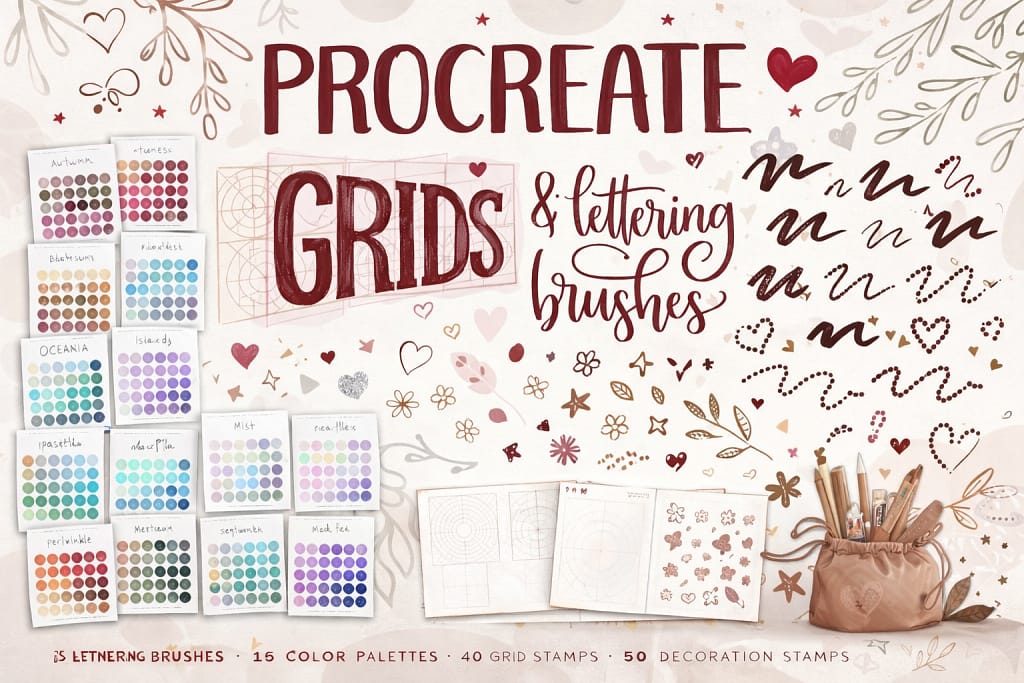
Why I picked it:
- ✅ Mathematical Grid Precision: The 40 included grid stamps are life-savers. They act as a perfect scaffold for sketches and lettering, making it effortless to maintain consistent heights and slants without drawing manual guidelines.
- ✅ Sharp Mechanical Feel: Instead of soft, crumbly leads, the brushes here are tuned for sharp, uniform lines. They mimic high-end technical drafting pencils that provide a constant line weight, perfect for detailed architectural work.
- ✅ Comprehensive Design Extras: With 15 curated color palettes and 50 decoration stamps, adding a professional polish to your technical drawings is easy. These extras help bridge the gap between a raw blueprint and a finished illustration.
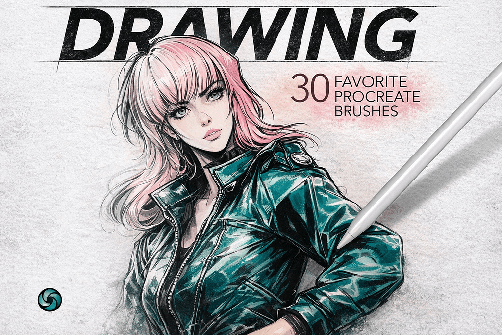
Why I picked it:
- ✅ All-in-One Utility: The variety is impressive. Switching between the scratchy dry brushes for initial construction and the smooth markers for bold fills feels intuitive, keeping the creative momentum going without any friction.
- ✅ Tactile Surface Depth: Five bonus paper textures provide a professional foundation. Layering these backgrounds under the drawings instantly adds a realistic "tooth" that makes every stroke look authentically physical.
- ✅ Zero-Filler Curation: Because these were curated as personal favorites, every brush serves a distinct purpose. The pressure sensitivity is tuned to perfection, making it incredibly easy to control line weight and opacity on the fly.
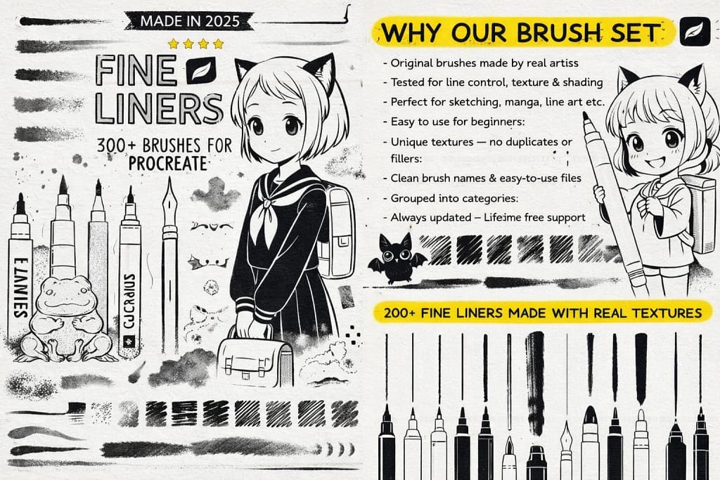
Why I picked it:
- ✅ Massive Technical Variety: I’m blown away by the 200+ textured line brushes. Switching between a technical micron for outlines and a soft pencil for construction feels incredibly fluid and natural.
- ✅ Pro Shading Logic: I noticed the 30+ shading brushes provide some of the smoothest gradients I’ve ever achieved in Procreate, making it easy to add depth to fine linework without it looking muddy.
- ✅ Stationery-Grade Depth: The 20 high-quality paper textures are a brilliant addition. I found that layering these beneath the fine liners instantly gives the digital ink an authentic, physical feel.
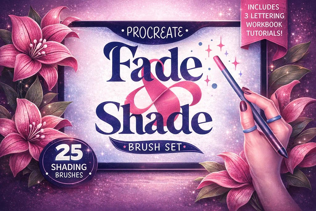
Why I picked it:
- ✅ Seamless Gradient Logic: The 10 shading brushes are exceptionally well-tuned. I found they allow for effortless transitions and soft shadows that blend perfectly without the typical "digital smudge" look.
- ✅ Real-Life Texture Sampling: The 15 texture brushes add an incredible layer of charisma. I noticed they were sampled from real-life materials, which gives the digital shading a tangible, organic soul.
- ✅ Educational Value: The included Procreate workbook and 3 lettering tutorials are a massive bonus. They offer a clear method on how to apply these textures effectively, making it a great set for both beginners and pros.
Why I picked it:
- ✅ Tactile Surface Variety: The range included is excellent. I noticed it covers everything from heavy watercolor grain to smooth fine stationery, allowing me to tailor the surface feel to the specific requirements of each project.
- ✅ Crystal Clear Resolution: These aren't blurry, low-quality scans. I found that even when zooming in on high-resolution canvases, the grain remains remarkably crisp, ensuring that the final output looks authentic and high-end.
- ✅ Effortless Analog Soul: Performance is smooth and doesn't lag the app. Adding these textures as an overlay is a simple step that provides a convincing analog depth which is usually very difficult to achieve in a purely digital environment.
FAQ
Yes, there are many free brushes available, but they often lack advanced features like tilt sensitivity and high-resolution grain. A standard free brush often looks like a simple grey line rather than graphite on paper.
Pro Tip: Instead of downloading low-quality freebies, you can use the Creative Fabrica $1 Trial. This allows you to download the premium sets listed in this article (normally $15+) essentially for free, giving you professional tools with realistic texture and shading capabilities immediately.
The secret isn't just the brush—it's the paper texture. Even the best 6B pencil brush will look fake on a plain white background. To achieve a traditional look:
Choose a brush from our list that supports tilt shading (using the side of the Apple Pencil).
Import a paper texture background (many packs in this list include them).
Don't use pure black (#000000); use a dark charcoal grey (#1A1A1A) for a softer, natural graphite effect.
For colored pencil art, you need a brush that mimics the "waxy" build-up of real Prismacolors. Look for brushes labeled as "Soft Core" or "Wax Based" in our collection. These allow you to layer colors naturally without them turning muddy. The Ultimate Pencil Bundle (mentioned above) is excellent for this because it blends color using the texture of the canvas, just like real pigments.
Absolutely. While many brushes mimic soft shading (6B or Charcoal), sets designed for technical drawing often include "Mechanical" or "0.5mm" presets. These maintain a consistent, sharp width regardless of pressure, making them perfect for architectural sketches, fine line details, or drafting manga layouts before inking.
If your pencil brush draws thin lines even when you tilt it for shading, check two things:
Brush Support: Ensure the brush is designed for sketching (like the ones in this list). Some default "monoline" brushes do not support tilt.
Settings: Go to Brush Studio -> Apple Pencil -> Tilt. Make sure the Opacity or Size sliders are active. All premium brushes in our Editor's Choice section come pre-configured for perfect tilt sensitivity out of the box.
